clubmate.fi

A good[ish] website

Web development blog, loads of UI and JavaScript topics

CSS beveled corners, take 2: a Sass Mixin

Filed under: Styling— Tagged with: beveled, mixin, sass

I refined the beveled corners method I posted about earlier. This includes a bunch os Sass mixins that do all the dirty work for you.

So, a beveled corner, a corner cut out of a box. So simple, yet so complex. With these three Sass mixins doing them is quit easy.

Here’s some requirements we want our mixins to fill:

  • corner-bevel-veryold() works in IE8 corner-bevel-old() works in IE9 corner-bevel-new() works in IE10 The beveled box needs to act like a normal div (it almost does) No extra elements No JS, images, Data URIs or other crap Can be used against a multicoloured background* As easy to use as border-radius

The corner-bevel-veryold() mixin

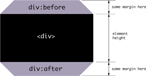
This supports IE8, the horizontal margins a bit wacky but it does the job if you really need to support that.

Here's the logic:

Example showing beveled corners in CSS

(Check out a selection of trapezoids that you can create with css.)

Demo

See a Demo rhlwG

Basic usage

.module {
  @include corner-bevel();
}

This results in a box with 20px bevel and grey background.

Configurable arguments

@mixin corner-bevel-veryold(
  $background-color: unquote('#aaa'),
  // Background color, default `#aaa
  $corner-bevel: 20px,
  // Bevel amount, default 20p
  $corner-top-left-bevel: true,
  // Boolean, false = sharp corne
  $corner-top-right-bevel: true,
  // Boolean, false = sharp corne
  $corner-bottom-right-bevel: true,
  // Boolean, false = sharp corne
  $corner-bottom-left-bevel: true // Boolean, false = sharp corne
);

All together:

.module {
  @include border-bevel('LightCoral', 20, true, false, false, false);
}

Other styling can of course be added in normal fashion.

.module {
  @include border-bevel('LightCoral', 20, true, false, false, true);
  display: inline;
  padding: 0 20px;
}

Limitations

  • Margins are a bit funny. You have to add the bevel height to it
  • Can't have border around the box
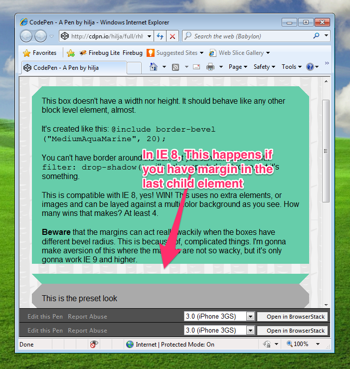
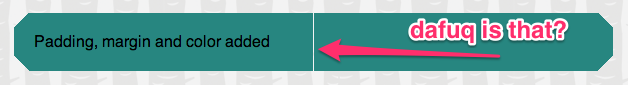
  • In IE8, you can't have margin in the last child element, use padding (see image below). Ironically, IE8 doesn't support :last-child pseudo class
  • You can't have top right bevel being 20px and top left being 10px, all bevels need to be the same amount (what you can do is to turn off each bevel)
Example showing beveled corners in CSS

The corner-bevel-old() mixin

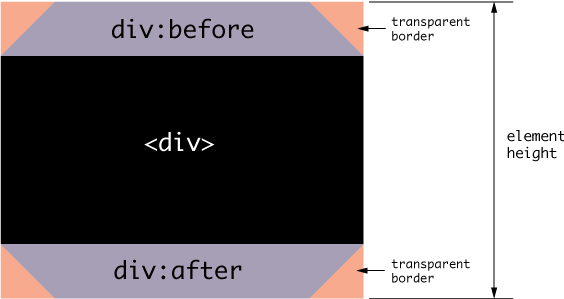
This works pretty much the same as the before mentioned mixin. Difference being that you don't need to mess with the margins, the element height includes the bevels. It works down to IE9.

The logic:

Example showing beveled corners in CSS

Configurable arguments

@mixin corner-bevel-old(
  $background-color: unquote('#aaa'),
  // Background color, default `#aaa
  $corner-bevel: 20px,
  // Bevel amount, default 20p
  $corner-top-left-bevel: true,
  // Boolean, false = sharp corne
  $corner-top-right-bevel: true,
  // Boolean, false = sharp corne
  $corner-bottom-right-bevel: true,
  // Boolean, false = sharp corne
  $corner-bottom-left-bevel: true // Boolean, false = sharp corne
);

Basic usage

.module {
  @include corner-bevel();
  // Apply padding and other styling to your liking
  padding: 0 20px;
}

Limitations

  • Can't have border around the box
  • You can't have top right bevel being 20px and top left being 10px, all bevels need to be the same amount (what you can do is to turn off each bevel)

The corner-bevel-new() mixin

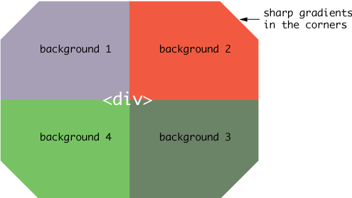
This is the best and shortest of these, downside being it uses the CSS gradients, that are not super widely supported. This technique was invented by Lea Verou.

The logic is thus:

Demo

See a Demo wnoEk

Configurable arguments

@mixin corner-bevel-new(
  $background-color: #aaa,
  // Background color, default `#aaa
  $corner-top-left-bevel: 10px,
  // Top left corner bevel amoun
  $corner-top-right-bevel: 10px,
  // Top right bevel amount bevel amoun
  $corner-bottom-right-bevel: 10px,
  // Bottom right corner bevel amoun
  $corner-bottom-left-bevel: 10px // Bottom left corner bevel amoun
);

Basic usage

.module {
  @include corner-bevel-new();
}

Different bevels amounts on each corner:

.module {
  @include corner-bevel-new(#888, 0px, 20px, 40px, 60px);
}

Limitations

  • Again, can't have border around the box
  • Chrome has a small rendering bug
    Chrome bug
    That’s why I’ve set the background to 50.5% rather than 50%: background-size: 50.5% 50%;

Comments would go here, but the commenting system isn’t ready yet, sorry.

  • © 2022 Antti Hiljá
  • About
  • All rights reserved yadda yadda.
  • I can put just about anything here, no one reads the footer anyways.
  • I love u!