clubmate.fi
A good[ish] website
Web development blog, loads of UI and JavaScript topics
How to handle icons in a React in 2021 | The technological singularity
How did we reach the icon singularity? What are the best ways to handle SVG icons in a modern React project, and how to effortlessly minify large quantities of icons. And also, we’ll look how to source free quality icons.
Roughly plotted timeline of icons on the web
Img: the easiest way to an icons just an img tag: <img src='icon.png' />, but that’s one HTTP request per icon, and since a big share of the page load time is latency, it matters. Also, 2x screens need a 2x asset.
Bitmap sprites: then we collectively figured out to do image sprites: put all the icons into one big image and load that once, then using some CSS-background-smartness, show only the needed bit. Fidgety as hell.
Icon fonts: turns out an icon could just be glyph in font and it only uses one HTTP call. That was brilliant, in a way, but it always felt kind of hacky; the sizing was weird and dealing with line-heights and all that was a pain.
SVGs and SVG sprites: then we properly figured out the SVG images, which scale to your hearts content not matter what screen density you’re on, and SVGs could be inlined. And soon after the SVG sprite technology started to get more popular, and the browser support grew. This actually solved the fidgetiness issue of sprites by providing a real, properly designed, mechanism to request a given portion of the sprite. This felt good, an actual solution to a problem with no major downsides! SVG sprite is the best way of handling an icon set on a non-React project.
The singularity: everything’s a React component and JavaScript is the only programming language we use. The best and the most endorphin inducing way of doing icons is just to think of them as React components. No new technology to learn, no libs to load, a problem solved just as a collateral effect of React.
How to use Icons as React components
I’ll be using this right-pointing arrow icon as an example:
The raw SVG of that arrow:
<?xml version="1.0" encoding="utf-8"?>
<!DOCTYPE svg PUBLIC "-//W3C//DTD SVG 1.1//EN" "http://www.w3.org/Graphics/SVG/1.1/DTD/svg11.dtd">
<svg
  version="1.1"
  xmlns="http://www.w3.org/2000/svg"
  xmlns:xlink="http://www.w3.org/1999/xlink"
  width="16"
  height="16"
  viewBox="0 0 16 16"
>
  <path fill="#000000" d="M15.5 8l-7.5-7.5v4.5h-8v6h8v4.5z"></path>
</svg>
We can turn it into a React component super easily, the SVG also contains a bunch of fluff that can be removed:
import React from 'react'

export const ArrowRight = props => (
  <svg viewBox="0 0 16 16" {...props}>
    <path d="M15.5 8L8 .5V5H0v6h8v4.5z" />
  </svg>
)
Here’s the explanation for the removed SVG attributes:
- The
versionattribute is not needed, it’s ballast and will be removed in the SVG 2.0 spec. - The
xmlnsattribute is not needed in inline SVGs. - The
xmlns:xlinkattribute is likewise not needed when inlining SVG. - The
widthattribute is removed because props are spread, choose the width when using the icon, or define it in the icon styles. heightditto.
But what about that d and fill attributes, how are they so different? Glad you asked.
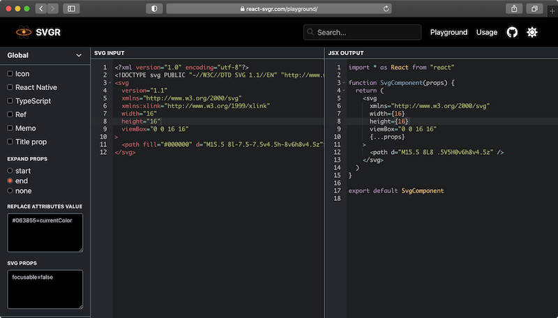
Automatically turn SVGs into React components with SVGR
There’s a great SVG tool called SVGR (the R stands for React), which turns SVGs into React components, minifying them in the process using SVGO, and formatting with prettier.
Below a quick rundown on how to use it.
SVGR Command line interface usage
You can use npx to quickly run it from your prompt, without installing anything:
$ npx @svgr/cli \
  --no-dimensions \
  --expand-props \
  --replace-attr-values "#000000=currentColor" \
arrow-right.svg- --no-dimensions
- Remove width and height from root SVG tag.
- --expand-props
- All properties given to component will be forwarded on SVG tag. Possible values: "start", "end" or false ("none" in CLI). Meaning the props are spread into the svg component:
{...props}. - --replace-attr-values
- This
"#000000=currentColor"replaces#000000withcurrentColorso the SVG inherits text color. It’s possible to do multiple values:#000=currentColor,#fff=currentColor. This can also be done in CSS:fill: currentcolor;.
All of the option are available in the SVGR docs.
Process a whole directory of icons:
$ npx @svgr/cli -d my-svgs --ignore-existing my-icon-components- -d
- Tells the script we’re dealing with a directory.
- --ignore-existing
- Does not override already existing files in the target dir.
SVGR WebPack usage
Install the WebPack extension of SVGR:
$ npm install @svgr/webpack --save-devConfiguration to be placed in webpack.config.js, see all options in the SVGR docs::
{
  test: /\.svg$/,
  use: ['@svgr/webpack'],
    options: {
    dimensions: false,
    expandProps: 'start'
  }
}
Then use the React component in your code:
import ArrowRight from './icons/arrow-right.svg'

const App = () => (
  <span>
    <ArrowRight />
  </span>
)
SVGR Node usage
When using the Node API the plugins are not included by default, they have to be defined in the options. Something like this:
import fs from 'fs'
import svgr from '@svgr/core'

const svgIcon = fs.readFileSync('./icons/arrow-right.svg')
const options = {
  dimensions: false,
  plugins: ['@svgr/plugin-svgo', '@svgr/plugin-jsx', '@svgr/plugin-prettier']
}

;(async () => {
  const icon = await svgr(svgIcon, options, { componentName: 'ArrowRight' })
  fs.writeFileSync('ArrowRight.js', icon)
})()
Manual usage
Honestly, I’ve never used SVGR programmatically, until I wrote the above examples. Because I’ve never needed to churn out icons in such volume, that it would be beneficial to script that. I usually make the React components manually if I’m dealing with already minified SVGs, or I've used extremely helpful SVGR GUI.
Where to find free SVG icons?
For the longest time I’ve been using IcoMoon’s free icon pack, they’re good for utility icons like arrows or social media logos etc. The SVGs can be copied from their GitHub. Also their Lindua icon pack is super crisp, it’s more for the situations when you want more illustrative feel from the icons. It’s $69, but I think it’s worth the money.
Other places to find free icons:
- feathericons.com
- This site has a small set of open source icons, you don’t need to login to download the icons.
- remixicon.com
- Also a small-ish, set of free icons. The site has a "Copy SVG" button, which is brilliant, just paste the SVG straight into the React component. It also gives the icons as a data URLs, not bad.
- icons.getbootstrap.com
- The Bootstrap project has a 1,200 strong open source icon set. The site allows you to copy the icons from the page as SVG. Or you can also install the icon set
npm i bootstrap-iconsto your system. - Super Tiny Icons
- Absolutely the best collection of brand icons. Super Tiny Icons prices itself of the very highly optimized icons, hence it’s name. For example the Twitter icon weighing only 414 Bytes, Facebook icon is cruises at 311 Bytes.
- svgrepo.com
- This site has a bewildering 300,000 icons selection. The icons can be downloaded straight. But with such a vast back catalogue, consistency is all over the place.
Conclusions
Icons as React components, and SVG sprites; that’s the sharpest edge of icon handling right now I think.
This post is not so much about using icons, but more about how to make icons. A correct usage of an icon comes with important accessibility requirements, and I’ve got a post on how to write a accessible and modern icon component. Have a look if you’re interested.
Comments would go here, but the commenting system isn’t ready yet, sorry.